
Logo identity design for Japanese Insurance brand Aichi-ken Kyosai
Having worked with onedotzero many times before, Japanese agency Dentsu approached onedotzero with an opportunity to pitch against their in-house team on the design of a new logo mark for their client Aichi-ken Kyosai's Life Insurance and Fire Insurance brand.
For the pitch onedotzero selected and collaborated with leading design agency Hawaii to design and develop a series of different routes the logo could take.
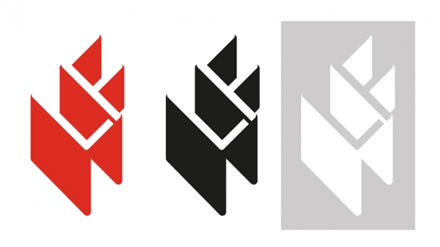
On winning the pitch, Hawaii developed their concept 'A Guiding Light', in which the featured letters of the brand ‘L’ + ‘F’ are turned to 45 degrees, and the negative space and extruding glyphs create a series of geometric forms that resemble a glowing light.
It was an important feature of the logo that it would sit comfortably with the existing kanji logo for clients who are not familiar with the new design.
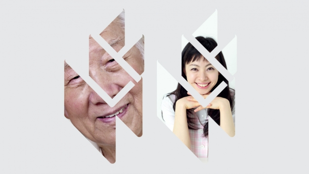
Colour, mono and white versions where developed to allow for flexibility when placing in a variety of contexts and layouts, including for use on branded collateral such as business cards, badges, uniforms. A masked version was also created to allow for the integration of photography and images within the identity.
Aichiken Kyosai Cooperative Society was founded in 1967. The Company's line of business includes managing pension, retirement, health, and welfare funds